Apparel Details Page
Apparel Details Page

Client: Sears Role: Art Director UX/UI Design
The Problem:
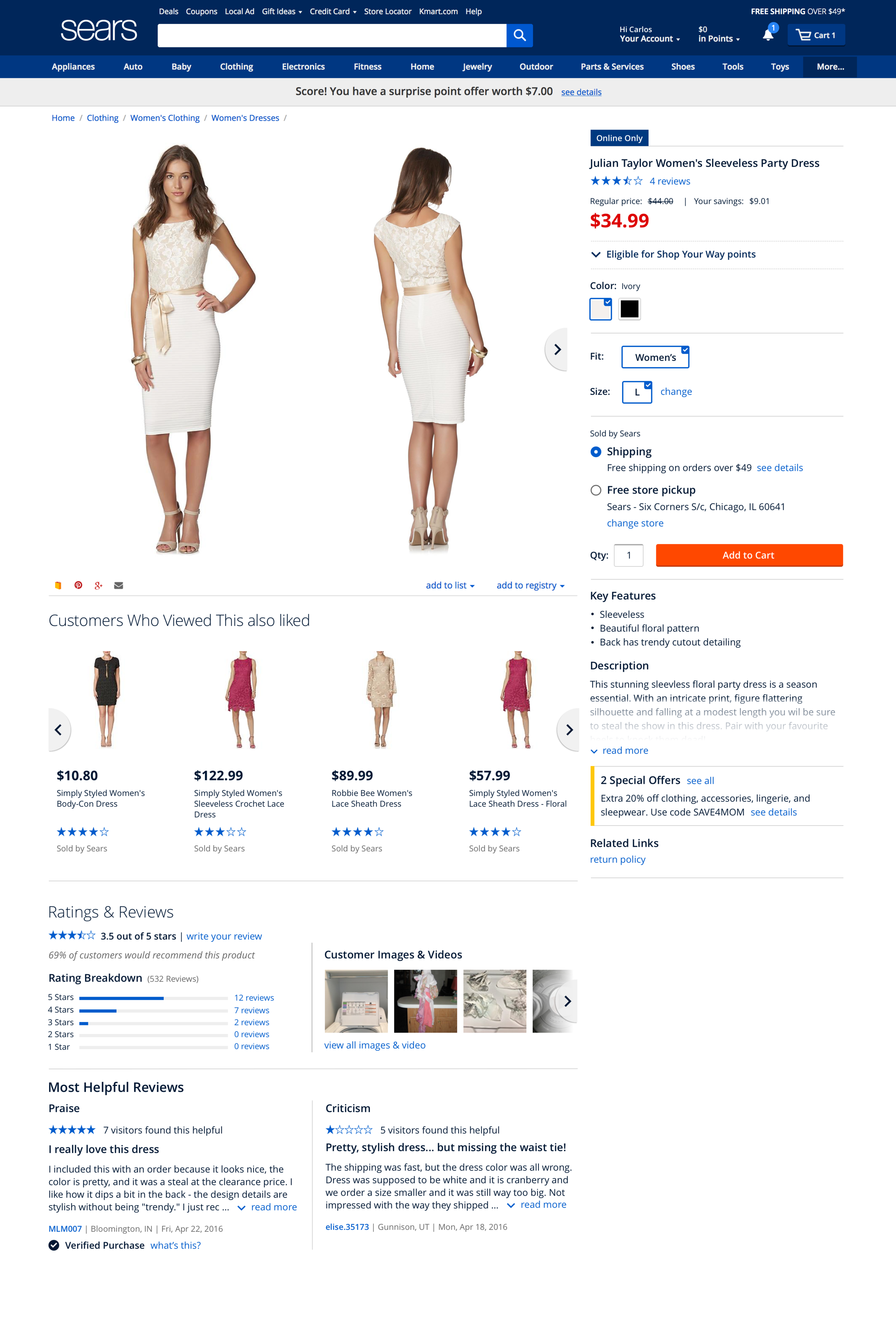
The original product details page for apparel lacked character, strength and style. Variant elements were hidden under the viewport, disrupting the connection between the product image and the user's selection. The product images were originally shy in size, on a product category where users need to almost be able to feel the product before they make a purchase without having the physical product in front of them.

The Solution:
The redesigned apparel page template puts the focus on the product image, which after a few rounds of research gave us a large size preferred by users. The product variants now live on the right column along with all the key elements of the product, such as pricing, fulfillment, description and features, and of course the primary call to action.
Users can now scroll through all these elements and make their variant and fulfillment selections, all while still be able to see the full large product image on the main column beside. After scrolling reaches its bottom, the rest of the page content (secondary elements) such as product recommendations, product reviews and Q&A are getting displayed leaving behind the core area and allowing the user to explore further.
This new template brought a 1.3% increase in cart visits, along with 81% user preference compared to the original design.
